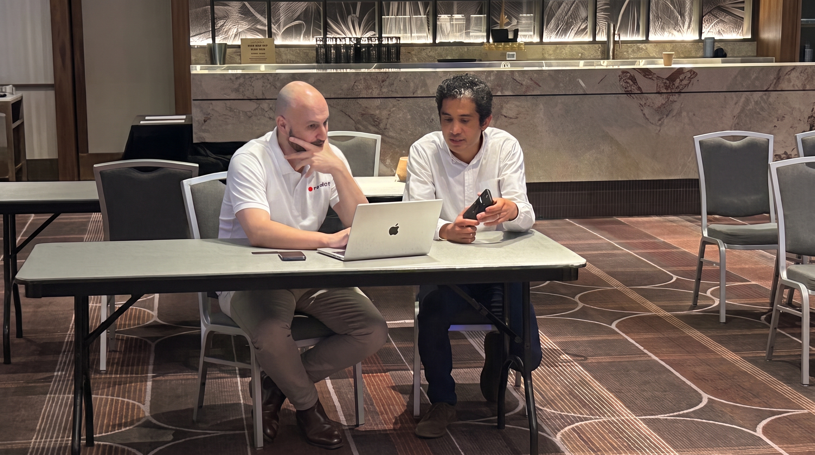
Trusted by Australian service business owners
Trusted by Australian business owners
Your service business, built with someone beside you.
We work with you 1:1 to plan it, then build it with you. All the tools included, and someone beside you 24/7.
"Signed my first $4,500 client in week 5. Noah's approach is simple, meticulous and gets results."
Noah Cohen · Founder Coaches every client. Real team behind him.
The problem
Four things hold service businesses back.
The work is good. The business side never got built properly, so leads fall through, follow-up slips, and the income never quite matches the hours.
See how revday fixes this
No clear offer or audience
Without clarity on who you help and what to charge, every conversation starts from scratch and nothing sticks.
Leads fall through the cracks
Someone reaches out. You get busy. By the time you follow up, they've moved on. Manual follow-up doesn't scale.
The tools that don't talk to each other
Calendly, Mailchimp, a website, invoicing software, a CRM you barely use. Paying for all of it and still doing the work by hand.
Figuring it out alone
YouTube tutorials, Facebook groups, advice from people who've never run your kind of business. Nobody in your corner who actually knows what to do next.
Just starting out AIM Audience, Initial Offer, Messaging A 12-week programme for people who need to get clear on who they help, what to charge, and how to explain it before building anything.
6 x 1:1 sessions with Noah
Tax agent consultation included
Most AIM clients move into BLAST once they finish
Learn about AIM
Ready to build BLAST Business Launch and Sales Training We plan it with you, build it with you, then coach you while you run it. From first enquiry to booked, paid and welcomed, in one place. The most common starting point.
Two live onboarding sessions with a specialist
4 hours of 1:1 coaching a month
All-in-one revday platform
When you are ready, CSA takes you further
Learn about BLAST
Already in business CSA Complete Sales Accelerator For established businesses where everything runs through you. Noah finds what depends on you and rebuilds it so your team can sell, deliver and follow up without you in the middle.
Audit of what only you can do, then the build to hand it off
8 hours of 1:1 coaching a month, more when you need it
All-in-one revday platform
Built for businesses that have outgrown BLAST
Learn about CSA
Who you are working with
Noah coaches every client. A real team backs him up.
Noah Cohen has spent 15 years in revenue enablement and coaching, teaching sales teams how to sell properly. He was part of the team that got Australia named the best-trained sales team at Intuit. He has worked inside financial services, SaaS, healthcare, and professional services, and he has watched the same problem show up everywhere: people who are great at their craft, but nobody ever showed them how to build the business around it.
He built revday to fix that. Noah coaches every revday client 1:1. When you book a call, you talk to Noah. Behind him, an onboarding specialist sets up your platform with you and a support team is there 24/7. Real people at every step, not a chatbot.
15 years in revenue enablement and coaching, across Australia and globally
Recognised for getting Australia named best-trained sales team at Intuit
An onboarding specialist and a 24/7 support team behind every client
Trusted by Australian service business owners
Meet Noah
Noah Cohen
Founder, revday
"I just wish I had hired Noah from day one in the business. He is incredibly intuitive and insightful about our business challenges."Christine Kininmonth, Event MC and Business Leader
"Noah Cohen knows and understands what it takes to grow sales. He showed us a very effective and easy-to-adopt approach when it came to prospecting and appointment setting… I recommend Noah Cohen to any business or individual who wants to skill up their sales force or grow their income."Wade Ebrahimi, COO and CFO
Book a free clarity call with Noah
30 minutes. He listens, tells you honestly which programme fits, and walks through what happens next.
30 min
Plan and set up
A specialist connects your domain, email and socials and shows you around the platform. Noah maps your customer journey and plans what to build.
Week 1 Build it together
Noah builds your booking, payments and follow-up with you, based on your plan. You get a handover guide explaining how it all works. Most clients are live in 3 to 4 weeks.
Weeks 2 to 4 You run it, with Noah beside you
Noah coaches you every month and the support team is there 24/7. No contract, no end date.
Ongoing Grow without guesswork
Your leads get followed up. Your business grows because the foundations are right.
Results
Client story
A1 Quality Care
Want this for your business?
Find my starting point
Free 4-minute clarity quiz. You get a personalised report on where to start.
Watch again
First client result $4,500
Alexander Lobb signed his first client in week 5 of BLAST. He sent this message the same day.
Direct message "Super stoked to have landed my first client with the system and confidence you have given me."
Alexander Lobb · BLAST client
"I just wish I had hired Noah from day one in the business. He is incredibly intuitive and insightful about our business challenges. I can thoroughly recommend Noah to anyone wishing to grow their business."
"Changing over to revday has been a game changer for us and simplified so many of our internal processes having everything inside one system. Noah and the team are unbelievably generous with their time. Highly recommend."
"revday's CRM has been a game changer for my business. From the moment a potential client visits your website, they are engaged, prompted, nurtured, and encouraged to take the next step. Thank you revday, Noah and team."
"revday is a fantastic sales and marketing solution for our business. We have had amazing support in getting it set up and Noah is incredibly knowledgeable. Thank you!"
"It organises essential business tools, CRM, lead generation, sales automation, and payments, into a seamless, user-friendly system. The platform is powerful yet easy to navigate. Highly recommend for entrepreneurs."
Google reviews
Australian owned and operated
What is revday? revday is a done-with-you coaching and software platform for Australian service business owners. It combines 1:1 coaching with Noah Cohen, an all-in-one business platform, and 24/7 live human support to help you start, build, and grow your business in the right order. You never get handed a login and left to figure it out alone.
How much does it cost? AIM is $2,800 one-time for the 12-week programme, and a payment plan is available. BLAST is $750 a month with no start fee. CSA is $2,000 a month. Both monthly programmes include 1:1 coaching with Noah, 24/7 support and the full revday platform, so they replace the messy stack of tools you are paying for separately. Not sure which fits? Book a free call and Noah will tell you honestly.
How do I know which programme is right for me? Start with the Clarity Quiz. It takes four minutes, is free, and points you toward the right programme based on exactly where your business is right now. If you would rather talk it through, book a free 30-minute call with Noah and he will tell you honestly which one fits.
What is the difference between AIM, BLAST, and CSA? AIM is a 12-week programme for people who need to get clear on who they help, what to charge, and how to explain it before building anything. It is built on the MOVE Framework and includes 6 x 1:1 sessions with Noah. BLAST is a monthly programme for service businesses ready to build the setup that takes a client from first enquiry to booked, paid and welcomed. We plan it and build it with you, then coach you while you run it. Includes 4 hours of 1:1 coaching a month, 24/7 support, and the all-in-one revday platform. No contract. Cancel anytime with 30 days' notice. CSA is a monthly programme for established service businesses where everything runs through the owner. Noah finds what depends on you and rebuilds it so your team can sell, deliver and follow up without you in the middle. Includes 8 hours of 1:1 coaching a month (more when you need it), 24/7 support, and the revday platform. No contract. Cancel anytime with 30 days' notice.
Is revday just software? No. AIM includes 6 x 1:1 coaching sessions with Noah across 12 weeks. BLAST includes 4 hours of 1:1 coaching a month and CSA includes 8 hours of 1:1 coaching a month with Noah, with more available when you need it. Both include 24/7 live human support alongside the all-in-one revday platform. You are never just handed a dashboard and left to figure it out alone.
Is there a contract? Can I cancel? No. BLAST and CSA are monthly programmes with no lock-in contract. You can cancel anytime with 30 days' notice. Those 30 days are so we can hand everything back to you properly: we give you a copy of your data and disconnect your website address (your domain) from revday, so nothing is left tied to us. You can also pause for up to 90 days instead. AIM is a flat-fee 12-week programme paid upfront. There is no ongoing obligation after AIM ends.
Who is revday for? revday is for Australian service business owners, including coaches and consultants, health and wellness practitioners, trades and home services, and creatives and events. It is not built for software (SaaS) or ecommerce businesses. If you are not sure, book a free call and Noah will tell you honestly whether revday fits.
Ready to build properly?
Stop figuring it out alone. Start building something that actually works.
Book a free 30-minute call with Noah. No pressure or hard sell, just a practical conversation about what your business needs right now.
30 minutes Free No pressure to decide
css:
*,*::before,*::after {
box-sizing: border-box;
margin: 0;
padding: 0
}
:root {
--red: #E80F42;
--red-dark: #C00D38;
--dark: #1F2733;
--dark2: #151C25;
--gray: #4B5563;
--gray-soft: #6B7280;
--border: #E5E7EB;
--bg: #F8F9FA;
--white: #FFFFFF;
--star: #F59E0B;
--green: #22C55E;
--spring: cubic-bezier(0.16,1,0.3,1)
}
html {
scroll-behavior: smooth
}
@media(prefers-reduced-motion:reduce) {
html {
scroll-behavior: auto
}
}
body {
font-family: 'Poppins','Poppins Fallback',system-ui,-apple-system,sans-serif;
color: var(--dark);
background: var(--white);
-webkit-font-smoothing: antialiased;
overflow-x: hidden
}
img {
display: block;
max-width: 100%
}
a {
color: inherit;
text-decoration: none
}
button {
font-family: inherit;
cursor: pointer;
border: none;
background: none
}
ul,ol {
list-style: none
}
.rd-container {
max-width: 1200px;
margin: 0 auto;
padding: 0 20px
}
@media(min-width:768px) {
.rd-container {
padding: 0 40px
}
}
.rd-btn-primary {
display: inline-flex;
align-items: center;
justify-content: center;
gap: 8px;
background: var(--red);
color: var(--white);
font-family: inherit;
font-size: 15px;
font-weight: 700;
padding: 16px 32px;
min-height: 52px;
border-radius: 9999px;
border: 2px solid var(--red);
text-decoration: none;
white-space: nowrap;
transition: background .2s ease,transform .2s var(--spring),box-shadow .2s ease
}
.rd-btn-primary:hover {
background: var(--red-dark);
border-color: var(--red-dark);
transform: translateY(-2px);
box-shadow: 0 12px 28px rgba(232,15,66,.3);
color: var(--white)
}
.rd-btn-primary svg {
width: 14px;
height: 14px;
stroke: currentColor;
fill: none;
stroke-width: 2.5;
stroke-linecap: round;
stroke-linejoin: round;
transition: transform .2s ease
}
.rd-btn-primary:hover svg {
transform: translateX(3px)
}
.rd-btn-primary:focus-visible {
outline: 3px solid var(--white);
outline-offset: 3px
}
.rd-btn-ghost {
display: inline-flex;
align-items: center;
justify-content: center;
gap: 8px;
background: transparent;
color: rgba(255,255,255,.6);
font-family: inherit;
font-size: 15px;
font-weight: 600;
padding: 16px 28px;
min-height: 52px;
border-radius: 9999px;
border: 1.5px solid rgba(255,255,255,.18);
text-decoration: none;
white-space: nowrap;
transition: border-color .2s ease,color .2s ease
}
.rd-btn-ghost:hover {
border-color: rgba(255,255,255,.4);
color: rgba(255,255,255,.9)
}
.rd-btn-ghost:focus-visible {
outline: 3px solid var(--white);
outline-offset: 3px
}
.rd-btn-light {
display: inline-flex;
align-items: center;
justify-content: center;
gap: 8px;
background: var(--white);
color: var(--dark);
font-family: inherit;
font-size: 15px;
font-weight: 700;
padding: 16px 32px;
min-height: 52px;
border-radius: 9999px;
border: none;
text-decoration: none;
white-space: nowrap;
transition: background .2s ease,transform .2s var(--spring),box-shadow .2s ease
}
.rd-btn-light:hover {
background: var(--bg);
transform: translateY(-2px);
box-shadow: 0 8px 20px rgba(0,0,0,.1);
color: var(--dark)
}
.rd-btn-light svg {
width: 14px;
height: 14px;
stroke: currentColor;
fill: none;
stroke-width: 2.5;
stroke-linecap: round;
stroke-linejoin: round
}
.rd-btn-light:focus-visible {
outline: 3px solid var(--dark);
outline-offset: 3px
}
.rd-eyebrow {
display: inline-block;
font-size: 12px;
font-weight: 600;
letter-spacing: .02em;
color: var(--gray-soft);
margin-bottom: 14px
}
.rd-eyebrow--red {
color: var(--red)
}
#rd-hero {
background: var(--dark);
position: relative;
overflow: hidden
}
#rd-hero .hero-grid {
position: absolute;
inset: 0;
background-image: linear-gradient(rgba(255,255,255,.016) 1px,transparent 1px),linear-gradient(90deg,rgba(255,255,255,.016) 1px,transparent 1px);
background-size: 60px 60px;
pointer-events: none;
mask-image: radial-gradient(ellipse 90% 70% at 50% 0%,black 0%,transparent 100%);
-webkit-mask-image: radial-gradient(ellipse 90% 70% at 50% 0%,black 0%,transparent 100%)
}
#rd-hero .hero-inner {
position: relative;
z-index: 1;
padding: 108px 20px 64px;
display: flex;
flex-direction: column;
align-items: center;
text-align: center;
gap: 36px;
max-width: 1200px;
margin: 0 auto
}
@media(min-width:900px) {
#rd-hero .hero-inner {
padding: 128px 40px 80px
}
}
@media(max-width:480px) {
#rd-hero .hero-inner {
padding: 80px 16px 56px;
gap: 20px
}
}
#rd-hero h1 {
font-size: clamp(34px,5.5vw,58px);
font-weight: 800;
line-height: 1.15;
letter-spacing: -0.01em;
color: var(--white);
max-width: 850px;
margin-inline: auto;
text-wrap: pretty;
text-wrap: balance;
overflow-wrap: break-word
}
#rd-hero h1 em {
font-style: normal;
color: var(--red)
}
#rd-hero .hero-sub {
font-size: clamp(16px,2vw,19px);
line-height: 1.75;
color: rgba(255,255,255,.62);
max-width: 600px
}
#rd-hero .hero-cta-group {
display: flex;
flex-direction: column;
align-items: center;
gap: 16px;
margin-top: 0
}
#rd-hero .hero-ctas {
display: flex;
flex-direction: column;
align-items: center;
gap: 10px;
width: 100%
}
@media(min-width:480px) {
#rd-hero .hero-ctas {
flex-direction: row;
justify-content: center;
width: auto
}
}
@media(max-width:480px) {
#rd-hero .rd-btn-primary,#rd-hero .rd-btn-ghost {
width: 100%
}
}
#rd-hero .hero-testimonial {
display: flex;
flex-direction: column;
align-items: center;
gap: 12px;
max-width: 480px;
width: 100%;
padding-top: 20px
}
#rd-hero .hero-testimonial-quote {
font-size: 15px;
font-weight: 500;
color: rgba(255,255,255,.78);
line-height: 1.6;
text-align: center;
margin: 0
}
#rd-hero .hero-testimonial-quote em {
color: #FFFFFF;
font-style: normal;
font-weight: 700
}
#rd-hero .hero-testimonial-footer {
display: flex;
align-items: center;
gap: 8px;
justify-content: center
}
#rd-hero .hero-t-avatar {
width: 28px;
height: 28px;
min-width: 28px;
border-radius: 50%;
background: rgba(232,15,66,.25);
display: flex;
align-items: center;
justify-content: center;
font-size: 11px;
font-weight: 700;
color: #FFFFFF;
font-family: 'Poppins','Poppins Fallback',system-ui,sans-serif;
flex-shrink: 0
}
#rd-hero .hero-testimonial-attr {
font-size: 12px;
font-weight: 600;
color: rgba(255,255,255,0.6)
}
#rd-hero .hero-micro {
font-size: 12.5px;
color: rgba(255,255,255,0.6);
font-weight: 500;
text-align: center;
margin-top: -6px
}
#rd-hero .hero-trust-pill {
display: inline-flex;
align-items: center;
gap: 8px;
background: rgba(255,255,255,.07);
border: 1px solid rgba(255,255,255,.12);
border-radius: 9999px;
padding: 8px 16px;
font-size: 12.5px;
font-weight: 600;
color: rgba(255,255,255,.8)
}
#rd-hero .hero-trust-stars {
display: flex;
gap: 2px;
flex-shrink: 0
}
#rd-hero .hero-trust-stars svg {
width: 11px;
height: 11px;
fill: #F59E0B;
display: block
}
#rd-hero .hero-trust-text {
white-space: nowrap
}
#rd-hero .hero-trust-pill {
max-width: calc(100vw - 48px)
}
#rd-hero .hero-trust-text--short {
display: none
}
@media(max-width:540px) {
#rd-hero .hero-trust-text--long {
display: none
}
#rd-hero .hero-trust-text--short {
display: inline
}
#rd-hero .hero-inner {
gap: 28px;
padding-top: 88px;
padding-bottom: 52px
}
}
a:focus {
outline: none
}
a:focus-visible {
outline: 3px solid #E80F42;
outline-offset: 3px;
border-radius: 20px
}
#rd-selector .sel-card:focus-visible {
outline: 3px solid #E80F42;
outline-offset: 3px
}
#rd-programmes .prog-card:focus-visible {
outline: 3px solid #E80F42;
outline-offset: 3px
}
@media(prefers-reduced-motion:reduce) {
.rd-btn-primary,.rd-btn-ghost,.rd-btn-light {
transition: none
}
.rd-btn-primary:hover,.rd-btn-light:hover {
transform: none;
box-shadow: none
}
}
#rd-pain {
background: var(--white);
padding: 96px 0
}
#rd-pain .pain-inner {
display: grid;
gap: 64px;
align-items: center
}
@media(min-width:900px) {
#rd-pain .pain-inner {
grid-template-columns: 1fr 1fr;
gap: 80px
}
}
#rd-pain .pain-left {
display: flex;
flex-direction: column;
gap: 14px
}
#rd-pain h2 {
font-size: clamp(28px,4vw,44px);
font-weight: 800;
line-height: 1.15;
letter-spacing: -0.01em;
color: var(--dark);
text-wrap: pretty
}
#rd-pain h2 em {
font-style: normal;
color: var(--red)
}
#rd-pain .pain-sub {
font-size: 17px;
color: var(--gray);
line-height: 1.7
}
#rd-pain .pain-link {
display: inline-flex;
align-items: center;
gap: 6px;
font-size: 14px;
font-weight: 700;
color: var(--red-dark)
}
#rd-pain .pain-link svg {
width: 13px;
height: 13px;
stroke: currentColor;
fill: none;
stroke-width: 2.5;
stroke-linecap: round;
stroke-linejoin: round;
transition: transform .2s ease
}
#rd-pain .pain-link:hover svg {
transform: translateX(4px)
}
#rd-pain .pain-cards {
display: flex;
flex-direction: column;
gap: 14px
}
#rd-pain .pain-card {
background: var(--white);
border: 1px solid var(--border);
border-radius: 16px;
padding: 20px 22px;
display: flex;
align-items: flex-start;
gap: 16px;
transition: border-color .2s ease,box-shadow .2s ease
}
#rd-pain .pain-card:hover {
border-color: rgba(232,15,66,.25);
box-shadow: 0 8px 24px rgba(31,39,51,.06)
}
#rd-pain .pain-card-ico {
width: 40px;
height: 40px;
min-width: 40px;
border-radius: 12px;
background: rgba(232,15,66,.08);
display: flex;
align-items: center;
justify-content: center;
flex-shrink: 0
}
#rd-pain .pain-card-ico svg {
width: 16px;
height: 16px;
stroke: var(--red);
fill: none;
stroke-width: 2;
stroke-linecap: round;
stroke-linejoin: round
}
#rd-pain .pain-card-body {
flex: 1;
min-width: 0
}
#rd-pain .pain-card-title {
font-size: 14px;
font-weight: 700;
color: var(--dark);
margin-bottom: 4px;
line-height: 1.3
}
#rd-pain .pain-card-desc {
font-size: 13px;
color: var(--gray-soft);
line-height: 1.5
}
#rd-programmes {
background: var(--white);
padding: 96px 0
}
#rd-programmes .prog-header {
text-align: center;
max-width: 600px;
margin: 0 auto 64px
}
#rd-programmes .prog-header h2 {
font-size: clamp(28px,4vw,44px);
font-weight: 800;
line-height: 1.15;
letter-spacing: -0.01em;
color: var(--dark);
text-wrap: pretty;
margin-bottom: 14px
}
#rd-programmes .prog-header p {
font-size: 17px;
color: var(--gray-soft);
line-height: 1.65
}
#rd-programmes .prog-grid {
display: grid;
gap: 20px;
grid-template-columns: 1fr
}
@media(min-width:768px) {
#rd-programmes .prog-grid {
grid-template-columns: repeat(3,1fr)
}
}
#rd-programmes .prog-card {
background: var(--bg);
border: 1px solid var(--border);
border-radius: 20px;
padding: 32px 28px;
display: flex;
flex-direction: column;
gap: 24px;
text-decoration: none;
color: inherit;
transition: border-color .2s ease,box-shadow .2s ease,transform .2s var(--spring);
position: relative;
overflow: hidden;
scroll-margin-top: 80px
}
#rd-programmes .prog-card:hover {
border-color: rgba(232,15,66,.3);
box-shadow: 0 16px 40px rgba(31,39,51,.08);
transform: translateY(-3px)
}
#rd-programmes .prog-card-top {
display: flex;
flex-direction: column;
gap: 8px
}
#rd-programmes .prog-card-ico {
width: 44px;
height: 44px;
border-radius: 14px;
background: rgba(232,15,66,.1);
display: flex;
align-items: center;
justify-content: center
}
#rd-programmes .prog-card-ico svg {
width: 18px;
height: 18px;
stroke: var(--red);
fill: none;
stroke-width: 2;
stroke-linecap: round;
stroke-linejoin: round
}
#rd-programmes .prog-card-stage {
font-size: 11px;
font-weight: 700;
letter-spacing: .06em;
color: var(--red-dark);
margin-top: 4px
}
#rd-programmes .prog-card-name {
font-size: 26px;
font-weight: 900;
letter-spacing: -.02em;
color: var(--dark);
line-height: 1
}
#rd-programmes .prog-card-tagline {
font-size: 12px;
color: var(--gray-soft);
font-weight: 500
}
#rd-programmes .prog-card-desc {
font-size: 14px;
color: var(--gray);
line-height: 1.65;
flex: 1
}
#rd-programmes .prog-card-features {
display: flex;
flex-direction: column;
gap: 8px
}
#rd-programmes .prog-feature {
display: flex;
align-items: center;
gap: 10px;
font-size: 13px;
font-weight: 500;
color: var(--gray)
}
#rd-programmes .prog-feature svg {
width: 14px;
height: 14px;
flex-shrink: 0;
stroke: var(--red);
fill: none;
stroke-width: 2.5;
stroke-linecap: round;
stroke-linejoin: round
}
#rd-programmes .prog-card-cta {
display: inline-flex;
align-items: center;
gap: 8px;
font-size: 14px;
font-weight: 700;
color: var(--red-dark);
margin-top: auto
}
#rd-programmes .prog-card-cta svg {
width: 13px;
height: 13px;
stroke: currentColor;
fill: none;
stroke-width: 2.5;
stroke-linecap: round;
stroke-linejoin: round;
transition: transform .2s ease
}
#rd-programmes .prog-card:hover .prog-card-cta svg {
transform: translateX(4px)
}
#rd-programmes .prog-quiz-strip {
margin-top: 48px;
text-align: center;
display: flex;
flex-direction: column;
align-items: center;
gap: 10px
}
#rd-programmes .prog-quiz-strip p {
font-size: 15px;
color: var(--gray-soft)
}
#rd-programmes .prog-journey {
display: grid;
grid-template-columns: repeat(3,1fr);
gap: 0;
width: 100%;
margin-bottom: 48px;
position: relative
}
#rd-programmes .prog-journey::before {
content: '';
position: absolute;
top: 5px;
left: calc((100%) / 6);
right: calc((100%) / 6);
height: 1px;
background: var(--border);
z-index: 0
}
#rd-programmes .prog-step {
display: flex;
flex-direction: column;
align-items: center;
gap: 8px;
position: relative;
z-index: 1
}
#rd-programmes .prog-dot {
width: 10px;
height: 10px;
border-radius: 50%;
background: var(--border);
border: 1px solid var(--border);
transition: background .3s var(--spring),border-color .3s var(--spring),transform .3s var(--spring);
flex-shrink: 0
}
#rd-programmes .prog-step.is-active .prog-dot {
background: var(--red);
border-color: var(--red);
transform: scale(1.5)
}
#rd-programmes .prog-label {
font-size: 11px;
font-weight: 700;
letter-spacing: .05em;
text-transform: uppercase;
color: var(--gray-soft);
white-space: nowrap;
transition: color .3s ease
}
#rd-programmes .prog-step.is-active .prog-label {
color: var(--red)
}
@media(max-width:767px) {
#rd-programmes .prog-journey {
display: none
}
}
#rd-programmes .prog-card-next {
display: flex;
align-items: center;
gap: 8px;
font-size: 12px;
font-weight: 600;
color: var(--gray);
padding: 10px 14px;
border-radius: 9px;
background: rgba(232,15,66,.04);
border: 1px solid rgba(232,15,66,.1);
line-height: 1.4
}
#rd-programmes .prog-card-next svg {
width: 13px;
height: 13px;
flex-shrink: 0;
color: var(--red)
}
#rd-programmes .prog-card-next--light svg {
color: rgba(255,255,255,.65)
}
#rd-platform {
background: var(--dark);
padding: 96px 0;
position: relative;
overflow: hidden
}
#rd-platform .platform-grid-bg {
position: absolute;
inset: 0;
background-image: linear-gradient(rgba(255,255,255,.013) 1px,transparent 1px),linear-gradient(90deg,rgba(255,255,255,.013) 1px,transparent 1px);
background-size: 60px 60px;
pointer-events: none;
mask-image: radial-gradient(ellipse 80% 60% at 50% 50%,black 0%,transparent 100%);
-webkit-mask-image: radial-gradient(ellipse 80% 60% at 50% 50%,black 0%,transparent 100%)
}
#rd-platform .platform-inner {
position: relative;
z-index: 1
}
#rd-platform .platform-header {
text-align: center;
max-width: 640px;
margin: 0 auto 64px
}
#rd-platform .platform-eyebrow {
font-size: 12px;
font-weight: 600;
color: rgba(255,255,255,0.6);
margin-bottom: 14px;
display: block
}
#rd-platform h2 {
font-size: clamp(28px,4vw,44px);
font-weight: 800;
line-height: 1.15;
letter-spacing: -0.01em;
color: var(--white);
text-wrap: pretty;
margin-bottom: 14px
}
#rd-platform .platform-sub {
font-size: 17px;
color: rgba(255,255,255,.65);
line-height: 1.65
}
#rd-platform .platform-features {
display: grid;
gap: 12px;
grid-template-columns: 1fr
}
@media(min-width:640px) {
#rd-platform .platform-features {
grid-template-columns: repeat(2,1fr)
}
}
@media(min-width:1024px) {
#rd-platform .platform-features {
grid-template-columns: repeat(3,1fr)
}
}
#rd-platform .platform-feat {
background: rgba(255,255,255,.04);
border: 1px solid rgba(255,255,255,.07);
border-radius: 16px;
padding: 22px;
display: flex;
align-items: flex-start;
gap: 14px;
transition: background .18s ease,border-color .18s ease
}
#rd-platform .platform-feat:hover {
background: rgba(255,255,255,.07);
border-color: rgba(232,15,66,.2)
}
#rd-platform .platform-feat-ico {
width: 36px;
height: 36px;
min-width: 36px;
border-radius: 10px;
background: rgba(232,15,66,.12);
display: flex;
align-items: center;
justify-content: center;
flex-shrink: 0
}
#rd-platform .platform-feat-ico svg {
width: 14px;
height: 14px;
stroke: var(--red);
fill: none;
stroke-width: 2;
stroke-linecap: round;
stroke-linejoin: round
}
#rd-platform .platform-feat-title {
font-size: 13.5px;
font-weight: 700;
color: rgba(255,255,255,.9);
margin-bottom: 3px;
line-height: 1.3
}
#rd-platform .platform-feat-desc {
font-size: 12px;
color: rgba(255,255,255,0.6);
line-height: 1.5
}
#rd-platform .platform-cta {
margin-top: 56px;
text-align: center;
display: flex;
flex-direction: column;
align-items: center;
gap: 10px
}
#rd-platform .platform-link {
display: inline-flex;
align-items: center;
gap: 6px;
font-size: 14px;
font-weight: 700;
color: var(--red)
}
#rd-platform .platform-link svg {
width: 13px;
height: 13px;
stroke: currentColor;
fill: none;
stroke-width: 2.5;
stroke-linecap: round;
stroke-linejoin: round;
transition: transform .2s ease
}
#rd-platform .platform-link:hover svg {
transform: translateX(4px)
}
#rd-noah {
background: var(--bg);
padding: 96px 0
}
#rd-noah .noah-inner {
display: grid;
gap: 64px;
align-items: center
}
@media(min-width:900px) {
#rd-noah .noah-inner {
grid-template-columns: 1fr 1fr;
gap: 80px
}
}
#rd-noah .noah-left {
display: flex;
flex-direction: column;
gap: 24px
}
#rd-noah .noah-eyebrow {
font-size: 12px;
font-weight: 600;
color: var(--gray-soft)
}
#rd-noah h2 {
font-size: clamp(26px,3.8vw,40px);
font-weight: 800;
line-height: 1.1;
letter-spacing: -0.01em;
color: var(--dark);
text-wrap: pretty
}
#rd-noah .noah-body {
font-size: 16px;
color: var(--gray);
line-height: 1.75
}
#rd-noah .noah-creds {
display: flex;
flex-direction: column;
gap: 10px
}
#rd-noah .noah-cred {
display: flex;
align-items: center;
gap: 12px;
font-size: 14px;
font-weight: 500;
color: var(--gray)
}
#rd-noah .noah-cred svg {
width: 16px;
height: 16px;
stroke: var(--red);
fill: none;
stroke-width: 2;
stroke-linecap: round;
stroke-linejoin: round;
flex-shrink: 0
}
#rd-noah .noah-right {
display: flex;
flex-direction: column;
gap: 20px
}
#rd-noah .noah-photo-wrap {
position: relative;
border-radius: 24px;
overflow: hidden;
aspect-ratio: 4/5;
background: var(--dark2)
}
#rd-noah .noah-photo-wrap img {
width: 100%;
height: 100%;
object-fit: cover
}
#rd-noah .noah-photo-badge {
position: absolute;
bottom: 20px;
left: 20px;
right: 20px;
background: rgba(31,39,51,.9);
backdrop-filter: blur(12px);
border: 1px solid rgba(255,255,255,.1);
border-radius: 14px;
padding: 14px 16px;
display: flex;
align-items: center;
gap: 12px
}
#rd-noah .noah-photo-badge-ico {
width: 36px;
height: 36px;
border-radius: 10px;
background: rgba(232,15,66,.2);
display: flex;
align-items: center;
justify-content: center;
flex-shrink: 0
}
#rd-noah .noah-photo-badge-text {
flex: 1;
min-width: 0
}
#rd-noah .noah-photo-badge-val {
font-size: 14px;
font-weight: 700;
color: var(--white);
line-height: 1.2
}
#rd-noah .noah-photo-badge-label {
font-size: 11px;
color: rgba(255,255,255,.6);
font-weight: 500
}
#rd-noah .noah-recs {
display: flex;
flex-direction: column;
gap: 12px
}
#rd-noah .noah-rec {
background: var(--white);
border: 1px solid var(--border);
border-radius: 14px;
padding: 16px 18px;
font-size: 13.5px;
color: var(--gray);
line-height: 1.6;
font-style: italic
}
#rd-noah .noah-rec-attr {
display: block;
margin-top: 8px;
font-size: 12px;
font-weight: 600;
color: var(--dark);
font-style: normal
}
#rd-how {
background: var(--white);
padding: 96px 0
}
#rd-how .how-header {
text-align: center;
max-width: 560px;
margin: 0 auto 64px
}
#rd-how .how-header h2 {
font-size: clamp(28px,4vw,44px);
font-weight: 800;
line-height: 1.15;
letter-spacing: -0.01em;
color: var(--dark);
text-wrap: pretty;
margin-bottom: 14px
}
#rd-how .how-header p {
font-size: 17px;
color: var(--gray-soft);
line-height: 1.65
}
#rd-how .how-steps {
display: grid;
gap: 0;
max-width: 680px;
margin: 0 auto;
position: relative
}
#rd-how .how-steps::before {
content: '';
position: absolute;
left: 22px;
top: 50px;
bottom: 50px;
width: 2px;
background: linear-gradient(to bottom,var(--red),rgba(232,15,66,.08));
z-index: 0
}
#rd-how .how-step {
display: flex;
align-items: flex-start;
gap: 20px;
padding: 20px 0
}
#rd-how .how-step-node {
width: 44px;
height: 44px;
min-width: 44px;
border-radius: 50%;
background: var(--red);
display: flex;
align-items: center;
justify-content: center;
position: relative;
z-index: 1;
box-shadow: 0 0 0 6px rgba(232,15,66,.08);
flex-shrink: 0
}
#rd-how .how-step-node svg {
width: 16px;
height: 16px;
stroke: var(--white);
fill: none;
stroke-width: 2;
stroke-linecap: round;
stroke-linejoin: round
}
#rd-how .how-step-body {
flex: 1;
background: var(--bg);
border: 1px solid var(--border);
border-radius: 14px;
padding: 18px 20px;
display: flex;
align-items: center;
gap: 12px;
transition: border-color .2s ease,box-shadow .2s ease
}
#rd-how .how-step-body:hover {
border-color: rgba(232,15,66,.25);
box-shadow: 0 6px 20px rgba(31,39,51,.05)
}
#rd-how .how-step-text {
flex: 1
}
#rd-how .how-step-title {
font-size: 14.5px;
font-weight: 700;
color: var(--dark);
margin-bottom: 2px
}
#rd-how .how-step-desc {
font-size: 12.5px;
color: var(--gray-soft);
line-height: 1.5
}
#rd-how .how-step-tag {
display: inline-flex;
align-items: center;
gap: 4px;
font-size: 10.5px;
font-weight: 600;
color: var(--red-dark);
background: rgba(232,15,66,.07);
border: 1px solid rgba(232,15,66,.15);
border-radius: 9999px;
padding: 4px 10px;
white-space: nowrap;
flex-shrink: 0
}
#rd-proof {
background: var(--dark);
padding: 96px 0;
position: relative;
overflow: hidden
}
#rd-proof .proof-grid-bg {
position: absolute;
inset: 0;
background-image: linear-gradient(rgba(255,255,255,.013) 1px,transparent 1px),linear-gradient(90deg,rgba(255,255,255,.013) 1px,transparent 1px);
background-size: 60px 60px;
pointer-events: none;
mask-image: radial-gradient(ellipse 80% 60% at 50% 50%,black 0%,transparent 100%);
-webkit-mask-image: radial-gradient(ellipse 80% 60% at 50% 50%,black 0%,transparent 100%)
}
#rd-proof .rd-container {
position: relative;
z-index: 1
}
#rd-proof .proof-header {
text-align: center;
max-width: 480px;
margin: 0 auto 56px
}
#rd-proof .proof-eyebrow {
display: inline-flex;
align-items: center;
gap: 8px;
font-size: 12px;
font-weight: 600;
color: rgba(255,255,255,0.6);
margin-bottom: 14px
}
#rd-proof .proof-eyebrow-dot {
width: 6px;
height: 6px;
border-radius: 50%;
background: var(--red);
flex-shrink: 0
}
#rd-proof .proof-header h2 {
font-size: clamp(26px,4vw,38px);
font-weight: 800;
line-height: 1.1;
letter-spacing: -0.01em;
color: var(--white);
text-wrap: pretty
}
#rd-proof .proof-cols {
display: grid;
gap: 24px;
grid-template-columns: 1fr
}
@media(min-width:900px) {
#rd-proof .proof-cols {
grid-template-columns: 1.2fr 1fr;
gap: 28px;
align-items: stretch
}
}
#rd-proof .proof-video-card {
background: rgba(255,255,255,.04);
border: 1px solid rgba(255,255,255,.07);
border-radius: 20px;
overflow: hidden;
display: flex;
flex-direction: column
}
#rd-proof .proof-stage {
position: relative;
aspect-ratio: 16/9;
width: 100%;
background: #111820
}
#rd-proof .proof-stage video {
width: 100%;
height: 100%;
display: block;
object-fit: cover
}
#rd-proof .proof-poster {
position: absolute;
inset: 0;
width: 100%;
height: 100%;
border: none;
cursor: pointer;
background: #111820;
display: flex;
flex-direction: column;
align-items: center;
justify-content: center;
gap: 14px;
font-family: inherit;
transition: opacity .3s ease
}
#rd-proof .proof-poster-label {
position: absolute;
top: 16px;
left: 16px;
font-size: 10px;
font-weight: 700;
letter-spacing: .02em;
color: rgba(255,255,255,.7);
background: rgba(255,255,255,.07);
border: 1px solid rgba(255,255,255,.1);
padding: 5px 11px;
border-radius: 100px
}
#rd-proof .proof-play {
width: 64px;
height: 64px;
border-radius: 50%;
background: var(--red);
display: flex;
align-items: center;
justify-content: center;
box-shadow: 0 12px 28px rgba(232,15,66,.4);
transition: transform .2s ease,box-shadow .2s ease
}
#rd-proof .proof-play svg {
width: 22px;
height: 22px;
fill: var(--white);
margin-left: 3px
}
#rd-proof .proof-poster:hover .proof-play {
transform: scale(1.08);
box-shadow: 0 16px 36px rgba(232,15,66,.5)
}
#rd-proof .proof-poster:focus-visible {
outline: 3px solid var(--red);
outline-offset: -6px
}
#rd-proof .proof-poster-name {
font-size: 13px;
font-weight: 600;
color: rgba(255,255,255,.7)
}
#rd-proof .proof-poster.is-hidden {
opacity: 0;
visibility: hidden;
pointer-events: none;
transition: opacity .3s ease,visibility 0s .3s
}
#rd-proof .proof-video-footer {
padding: 20px 24px;
display: flex;
align-items: center;
gap: 10px
}
#rd-proof .proof-g {
width: 15px;
height: 15px;
flex-shrink: 0
}
#rd-proof .proof-g svg {
width: 100%;
height: 100%;
display: block
}
#rd-proof .proof-stars {
display: flex;
gap: 1px;
flex-shrink: 0
}
#rd-proof .proof-stars svg {
width: 11px;
height: 11px;
fill: var(--star);
display: block
}
#rd-proof .proof-video-quote {
font-size: 13px;
font-weight: 600;
color: rgba(255,255,255,.85)
}
#rd-proof .proof-video-attr {
font-size: 11px;
color: rgba(255,255,255,0.6);
font-weight: 500;
margin-top: 2px
}
#rd-proof .proof-stat-card {
background: rgba(255,255,255,.04);
border: 1px solid rgba(255,255,255,.07);
border-radius: 20px;
padding: 28px;
display: flex;
flex-direction: column;
gap: 24px
}
#rd-proof .proof-result {
display: flex;
flex-direction: column;
gap: 6px
}
#rd-proof .proof-result-label {
font-size: 11px;
font-weight: 700;
letter-spacing: .04em;
color: rgba(255,255,255,0.6)
}
#rd-proof .proof-result-val {
font-size: clamp(36px,4vw,48px);
font-weight: 900;
color: var(--white);
letter-spacing: -.02em;
line-height: 1
}
#rd-proof .proof-result-sub {
font-size: 13px;
color: rgba(255,255,255,.6);
line-height: 1.5
}
#rd-proof .proof-div {
height: 1px;
background: rgba(255,255,255,.07)
}
#rd-proof .proof-dm {
display: flex;
flex-direction: column;
gap: 8px
}
#rd-proof .proof-dm-badge {
display: inline-flex;
align-items: center;
font-size: 10px;
font-weight: 700;
letter-spacing: .02em;
color: var(--white);
background: rgba(232,15,66,.85);
padding: 3px 10px;
border-radius: 9999px;
width: fit-content
}
#rd-proof .proof-dm-text {
font-size: 15px;
font-weight: 700;
color: var(--white);
line-height: 1.45;
letter-spacing: -.01em
}
#rd-proof .proof-dm-attr {
font-size: 12px;
color: rgba(255,255,255,0.6);
font-weight: 500
}
#rd-proof .proof-tags {
display: flex;
flex-wrap: wrap;
gap: 8px
}
#rd-proof .proof-tag {
display: inline-flex;
align-items: center;
gap: 5px;
background: rgba(255,255,255,.05);
border: 1px solid rgba(255,255,255,.08);
border-radius: 9999px;
padding: 5px 12px;
font-size: 11px;
font-weight: 600;
color: rgba(255,255,255,.65)
}
#rd-proof .proof-tag-dot {
width: 5px;
height: 5px;
border-radius: 50%;
background: var(--red);
flex-shrink: 0;
opacity: .8
}
@media(max-width:480px) {
#rd-proof .proof-stat-card {
padding: 22px 18px
}
}
#rd-reviews {
background: var(--white);
padding: 96px 0
}
#rd-reviews .reviews-header {
text-align: center;
max-width: 560px;
margin: 0 auto 56px
}
#rd-reviews .reviews-header h2 {
font-size: clamp(26px,4vw,38px);
font-weight: 800;
line-height: 1.1;
letter-spacing: -0.01em;
color: var(--dark);
margin-bottom: 14px;
text-wrap: pretty
}
#rd-reviews .reviews-header p {
font-size: 16px;
color: var(--gray-soft);
line-height: 1.65
}
#rd-reviews .reviews-grid {
display: grid;
gap: 16px;
margin-bottom: 48px
}
@media(min-width:640px) {
#rd-reviews .reviews-grid {
grid-template-columns: repeat(2,1fr)
}
}
@media(min-width:1024px) {
#rd-reviews .reviews-grid {
grid-template-columns: repeat(3,1fr)
}
}
#rd-reviews .review-card {
background: var(--bg);
border: 1px solid var(--border);
border-radius: 16px;
padding: 24px;
display: flex;
flex-direction: column;
gap: 14px;
transition: border-color .18s ease,box-shadow .18s ease
}
#rd-reviews .review-card:hover {
border-color: rgba(232,15,66,.2);
box-shadow: 0 8px 24px rgba(31,39,51,.07)
}
#rd-reviews .review-card--featured {
background: var(--dark);
border-color: var(--dark)
}
#rd-reviews .review-card--featured:hover {
border-color: rgba(232,15,66,.3)
}
#rd-reviews .review-rating-row {
display: flex;
align-items: center;
gap: 6px
}
#rd-reviews .review-g {
width: 14px;
height: 14px;
flex-shrink: 0
}
#rd-reviews .review-g svg {
width: 100%;
height: 100%;
display: block
}
#rd-reviews .review-stars {
display: flex;
gap: 2px
}
#rd-reviews .review-stars svg {
width: 12px;
height: 12px;
fill: var(--star);
display: block
}
#rd-reviews .review-body {
font-size: 14px;
color: var(--gray);
line-height: 1.7;
flex: 1
}
#rd-reviews .review-body strong {
font-weight: 700;
color: var(--dark)
}
#rd-reviews .review-card--featured .review-body {
color: rgba(255,255,255,.75)
}
#rd-reviews .review-card--featured .review-body strong {
color: var(--white)
}
#rd-reviews .review-footer {
display: flex;
align-items: center;
gap: 10px;
padding-top: 12px;
border-top: 1px solid var(--border)
}
#rd-reviews .review-card--featured .review-footer {
border-top-color: rgba(255,255,255,.08)
}
#rd-reviews .review-avatar {
width: 34px;
height: 34px;
border-radius: 50%;
flex-shrink: 0;
background: rgba(232,15,66,.08);
display: flex;
align-items: center;
justify-content: center;
font-size: 13px;
font-weight: 700;
color: var(--red-dark)
}
#rd-reviews .review-card--featured .review-avatar {
background: rgba(255,255,255,.1);
color: rgba(255,255,255,.85)
}
#rd-reviews .review-name {
font-size: 13px;
font-weight: 700;
color: var(--dark)
}
#rd-reviews .review-source {
font-size: 11px;
color: var(--gray-soft);
font-weight: 500;
margin-top: 1px
}
#rd-reviews .review-card--featured .review-name {
color: var(--white)
}
#rd-reviews .review-card--featured .review-source {
color: rgba(255,255,255,0.6)
}
#rd-reviews .reviews-bottom {
display: flex;
flex-direction: column;
align-items: center;
gap: 6px;
text-align: center
}
#rd-reviews .reviews-google-row {
display: flex;
align-items: center;
gap: 8px;
flex-wrap: wrap;
justify-content: center
}
#rd-reviews .review-g-ico {
width: 17px;
height: 17px
}
#rd-reviews .review-g-ico svg {
width: 100%;
height: 100%;
display: block
}
#rd-reviews .reviews-g-stars {
display: flex;
gap: 2px
}
#rd-reviews .reviews-g-stars svg {
width: 13px;
height: 13px;
fill: var(--star);
display: block
}
#rd-reviews .reviews-g-score {
font-size: 14px;
font-weight: 700;
color: var(--dark)
}
#rd-reviews .reviews-g-label {
font-size: 13px;
color: var(--gray-soft);
font-weight: 500
}
@media(max-width:767px) {
#rd-reviews {
padding: 72px 0
}
#rd-proof {
padding: 72px 0
}
}
@media(prefers-reduced-motion:reduce) {
#rd-reviews .review-card,#rd-proof .proof-poster,#rd-proof .proof-play {
transition: none
}
#rd-proof .proof-poster:hover .proof-play {
transform: none
}
}
#rd-faq {
background: var(--bg);
padding: 96px 0
}
#rd-faq .faq-header {
text-align: center;
max-width: 560px;
margin: 0 auto 48px
}
#rd-faq .faq-eyebrow {
font-size: 12px;
font-weight: 600;
color: var(--gray-soft);
display: block;
margin-bottom: 12px
}
#rd-faq .faq-header h2 {
font-size: clamp(26px,3.8vw,40px);
font-weight: 800;
line-height: 1.15;
letter-spacing: -0.01em;
color: var(--dark);
margin-bottom: 12px;
text-wrap: pretty
}
#rd-faq .faq-header p {
font-size: 16px;
color: var(--gray-soft);
line-height: 1.65
}
#rd-faq .faq-grid {
display: grid;
grid-template-columns: 1fr;
gap: 10px
}
@media(min-width:768px) {
#rd-faq .faq-grid {
grid-template-columns: repeat(2,1fr);
gap: 14px
}
}
#rd-faq .faq-item {
background: var(--white);
border: 1px solid var(--border);
border-radius: 16px;
overflow: hidden;
transition: border-color .2s ease,box-shadow .2s ease
}
#rd-faq .faq-item:hover {
border-color: rgba(232,15,66,.3);
box-shadow: 0 8px 24px rgba(31,39,51,.06)
}
#rd-faq .faq-item.is-open {
border-color: var(--red)
}
#rd-faq .faq-btn {
width: 100%;
display: flex;
justify-content: space-between;
align-items: center;
padding: 1.5rem 1.75rem;
background: none;
border: none;
font-family: inherit;
color: var(--dark);
text-align: left;
cursor: pointer;
gap: 1.5rem
}
#rd-faq .faq-btn:focus-visible {
outline: 2px solid var(--red);
outline-offset: -2px;
border-radius: 16px
}
#rd-faq .faq-q {
font-size: 15px;
font-weight: 700;
line-height: 1.3
}
#rd-faq .faq-icon {
width: 32px;
height: 32px;
border-radius: 50%;
background: var(--bg);
display: flex;
align-items: center;
justify-content: center;
flex-shrink: 0;
transition: background .2s ease,transform .3s var(--spring);
position: relative
}
#rd-faq .faq-icon::before,#rd-faq .faq-icon::after {
content: '';
position: absolute;
background: var(--dark);
transition: background .2s ease
}
#rd-faq .faq-icon::before {
width: 2px;
height: 13px
}
#rd-faq .faq-icon::after {
width: 13px;
height: 2px
}
#rd-faq .faq-item.is-open .faq-icon {
background: var(--red);
transform: rotate(135deg)
}
#rd-faq .faq-item.is-open .faq-icon::before,#rd-faq .faq-item.is-open .faq-icon::after {
background: var(--white)
}
#rd-faq .faq-answer {
max-height: 0;
overflow: hidden;
transition: max-height .4s cubic-bezier(.4,0,.2,1)
}
#rd-faq .faq-answer-inner {
padding: 0 1.75rem 1.5rem;
font-size: 14.5px;
color: var(--gray);
line-height: 1.7
}
#rd-cta {
background: var(--dark);
padding: 96px 0;
position: relative;
overflow: hidden
}
#rd-cta .cta-grid {
position: absolute;
inset: 0;
background-image: linear-gradient(rgba(255,255,255,.013) 1px,transparent 1px),linear-gradient(90deg,rgba(255,255,255,.013) 1px,transparent 1px);
background-size: 60px 60px;
pointer-events: none;
mask-image: radial-gradient(ellipse 80% 60% at 50% 0%,black 0%,transparent 100%);
-webkit-mask-image: radial-gradient(ellipse 80% 60% at 50% 0%,black 0%,transparent 100%)
}
#rd-cta .cta-inner {
position: relative;
z-index: 1;
max-width: 720px;
margin: 0 auto;
text-align: center;
display: flex;
flex-direction: column;
align-items: center;
gap: 28px
}
#rd-cta .cta-eyebrow {
font-size: 12px;
font-weight: 600;
color: rgba(255,255,255,0.6)
}
#rd-cta h2 {
font-size: clamp(30px,5vw,52px);
font-weight: 800;
line-height: 1.15;
letter-spacing: -0.01em;
color: var(--white);
text-wrap: pretty
}
#rd-cta h2 em {
font-style: normal;
color: var(--red)
}
#rd-cta .cta-sub {
font-size: 17px;
color: rgba(255,255,255,.65);
line-height: 1.65;
max-width: 520px
}
#rd-cta .cta-buttons {
display: flex;
flex-direction: column;
align-items: center;
gap: 12px;
width: 100%
}
@media(min-width:480px) {
#rd-cta .cta-buttons {
flex-direction: row;
justify-content: center;
width: auto
}
}
#rd-cta .cta-reassure {
font-size: 12px;
color: rgba(255,255,255,.6);
display: flex;
align-items: center;
gap: 6px;
flex-wrap: wrap;
justify-content: center
}
#rd-cta .cta-reassure-sep {
width: 3px;
height: 3px;
border-radius: 50%;
background: rgba(255,255,255,.4);
flex-shrink: 0
}
#rd-cta .cta-progs {
display: flex;
flex-wrap: wrap;
justify-content: center;
gap: 10px;
width: 100%
}
#rd-cta .cta-prog {
display: flex;
flex-direction: column;
align-items: center;
gap: 4px;
padding: 16px 22px;
background: rgba(255,255,255,.04);
border: 1px solid rgba(255,255,255,.07);
border-radius: 14px;
text-decoration: none;
flex: 1;
max-width: 200px;
transition: background .2s ease,border-color .2s ease,transform .2s ease
}
#rd-cta .cta-prog:hover {
background: rgba(255,255,255,.08);
border-color: rgba(232,15,66,.25);
transform: translateY(-2px)
}
#rd-cta .cta-prog-name {
font-size: 15px;
font-weight: 800;
color: var(--white)
}
#rd-cta .cta-prog-desc {
font-size: 11px;
color: rgba(255,255,255,.7);
text-align: center;
line-height: 1.4
}
@media(max-width:480px) {
#rd-cta .cta-inner {
gap: 20px
}
#rd-cta .rd-btn-primary,#rd-cta .rd-btn-ghost {
width: 100%
}
}
@media(prefers-reduced-motion:reduce) {
#rd-faq .faq-answer,#rd-faq .faq-item,#rd-faq .faq-icon,#rd-faq .faq-icon::before,#rd-faq .faq-icon::after {
transition: none
}
#rd-cta .cta-prog:hover {
transform: none
}
}
#rd-selector {
background: var(--bg);
padding: 80px 0 72px;
border-bottom: 1px solid var(--border)
}
#rd-selector *,#rd-selector *::before,#rd-selector *::after {
box-sizing: border-box
}
#rd-selector .sel-inner {
display: flex;
flex-direction: column;
align-items: center;
gap: 40px
}
#rd-selector .sel-header {
text-align: center;
max-width: 520px
}
#rd-selector .sel-header h2 {
font-size: clamp(26px,3.8vw,40px);
font-weight: 800;
line-height: 1.1;
letter-spacing: -0.01em;
color: var(--dark);
margin-bottom: 10px;
text-wrap: pretty
}
#rd-selector .sel-header p {
font-size: 16px;
color: var(--gray);
line-height: 1.6;
text-wrap: balance
}
#rd-selector .sel-grid {
display: grid;
grid-template-columns: 1fr;
gap: 16px;
width: 100%
}
@media (min-width:768px) {
#rd-selector .sel-grid {
grid-template-columns: repeat(3,1fr);
align-items: stretch
}
}
#rd-selector .sel-card {
display: flex;
flex-direction: column;
gap: 12px;
background: var(--white);
border: 1.5px solid var(--border);
border-radius: 20px;
padding: 22px 20px;
text-decoration: none;
color: inherit;
transition: border-color 0.2s ease,box-shadow 0.2s ease,transform 0.2s var(--spring)
}
@media (min-width:768px) {
#rd-selector .sel-card {
padding: 26px 24px
}
}
#rd-selector .sel-card:hover {
border-color: rgba(31,39,51,0.3);
box-shadow: 0 16px 40px rgba(31,39,51,0.09);
transform: translateY(-3px)
}
#rd-selector .sel-card:focus-visible {
outline: 3px solid var(--red);
outline-offset: 3px
}
/* The visitor's own words, in a speech bubble. "I'm" is the opener on its own line, so the sentence is easy to take in */
#rd-selector .sel-bubble {
--bub-fill: #FDECEF;
--bub-line: #F9C4D0;
position: relative;
background: var(--bub-fill);
border: 1.5px solid var(--bub-line);
border-radius: 18px 18px 18px 6px;
padding: 14px 18px 16px;
margin-bottom: 8px;
transition: background .2s ease,border-color .2s ease
}
/* The tail is a small drawn shape with a rounded tip. Its outline runs on from the bubble's border */
#rd-selector .sel-bubble::after {
content: '';
position: absolute;
left: 18.5px;
bottom: -16px;
width: 26px;
height: 16px;
background: url("data:image/svg+xml,%3Csvg xmlns='http://www.w3.org/2000/svg' viewBox='0 0 26 16'%3E%3Cpath d='M1 0H23L9.6 9.6C8 10.8 6.6 12.2 5.2 13.4C3.6 14.8 1 14.4 1 12Z' fill='%23FDECEF'/%3E%3Cpath d='M23 0L9.6 9.6C8 10.8 6.6 12.2 5.2 13.4C3.6 14.8 1 14.4 1 12V0' fill='none' stroke='%23F9C4D0' stroke-width='1.5' stroke-linejoin='round' stroke-linecap='butt'/%3E%3C/svg%3E") no-repeat 0 0 / 100% 100%;
transition: none
}
#rd-selector .sel-card:hover .sel-bubble {
--bub-fill: #FBDDE4;
--bub-line: #F59FB3
}
#rd-selector .sel-card:hover .sel-bubble::after {
background-image: url("data:image/svg+xml,%3Csvg xmlns='http://www.w3.org/2000/svg' viewBox='0 0 26 16'%3E%3Cpath d='M1 0H23L9.6 9.6C8 10.8 6.6 12.2 5.2 13.4C3.6 14.8 1 14.4 1 12Z' fill='%23FBDDE4'/%3E%3Cpath d='M23 0L9.6 9.6C8 10.8 6.6 12.2 5.2 13.4C3.6 14.8 1 14.4 1 12V0' fill='none' stroke='%23F59FB3' stroke-width='1.5' stroke-linejoin='round' stroke-linecap='butt'/%3E%3C/svg%3E")
}
#rd-selector .sel-iam {
display: block;
font-size: 24px;
font-weight: 900;
line-height: 1.1;
letter-spacing: -0.02em;
color: var(--red-dark);
margin-bottom: 4px
}
#rd-selector .sel-q {
font-size: 17px;
font-weight: 700;
line-height: 1.35;
letter-spacing: -0.01em;
color: var(--dark);
margin: 0;
text-wrap: pretty
}
#rd-selector .sel-desc {
font-size: 14px;
color: var(--gray);
line-height: 1.6;
flex: 1;
margin: 0
}
/* The review snippet: a plain quote box, separate from the speech bubble */
#rd-selector .sel-proof {
background: var(--bg);
border: 1px solid var(--border);
border-radius: 10px;
padding: 12px 14px;
display: flex;
flex-direction: column;
gap: 3px
}
#rd-selector .sel-proof-quote {
font-size: 14px;
font-weight: 600;
color: var(--dark);
line-height: 1.45;
font-style: italic;
margin: 0;
text-wrap: pretty
}
#rd-selector .sel-proof-attr {
font-size: 12.5px;
font-weight: 600;
color: var(--gray);
margin: 0
}
#rd-selector .sel-cta {
display: inline-flex;
align-items: center;
gap: 6px;
min-height: 24px;
font-size: 14px;
font-weight: 700;
color: var(--red-dark);
margin-top: auto
}
#rd-selector .sel-cta svg {
width: 13px;
height: 13px;
flex-shrink: 0;
stroke: currentColor;
fill: none;
stroke-width: 2.5;
stroke-linecap: round;
stroke-linejoin: round;
transition: transform 0.2s ease
}
#rd-selector .sel-card:hover .sel-cta svg {
transform: translateX(4px)
}
#rd-selector .sel-fallback {
font-size: 14px;
color: var(--gray);
text-align: center
}
#rd-selector .sel-fallback a {
color: var(--red-dark);
font-weight: 700;
text-decoration: none;
border-bottom: 1px solid rgba(192,13,56,0.25);
transition: border-color 0.15s ease
}
#rd-selector .sel-fallback a:hover {
border-bottom-color: var(--red-dark)
}
#rd-selector .sel-fallback a:focus-visible {
outline: 2px solid var(--red);
outline-offset: 3px;
border-radius: 2px
}
@media (max-width:767px) {
#rd-selector {
padding: 56px 0 48px
}
#rd-selector .sel-inner {
gap: 28px
}
}
@media (prefers-reduced-motion:reduce) {
#rd-selector .sel-card,#rd-selector .sel-bubble,#rd-selector .sel-bubble,#rd-selector .sel-cta svg {
transition: none
}
#rd-selector .sel-card:hover {
transform: none;
box-shadow: none
}
#rd-selector .sel-card:hover .sel-cta svg {
transform: none
}
}
#rd-programmes .prog-card:target {
border-color: #E80F42;
box-shadow: 0 16px 40px rgba(31,39,51,.08);
outline: none
}
#rd-programmes .prog-card--featured:target {
border-color: rgba(232,15,66,.6)
}
#rd-programmes .prog-card.is-selected {
border-color: rgba(232,15,66,.4);
box-shadow: 0 16px 40px rgba(31,39,51,.1);
transform: translateY(-3px)
}
#rd-programmes .prog-card--featured.is-selected {
border-color: rgba(232,15,66,.6)
}
/* Touch targets: invisible hit area to 44px high, no layout change */
main .pain-link,main .platform-link {
position: relative
}
main .pain-link::after,main .platform-link::after {
content: "";
position: absolute;
inset: -12px -2px
}
/* ── New hero: Noah beside the promise (two columns on desktop) ── */
#rd-hero .hero-inner {
align-items: stretch;
text-align: left;
gap: 40px
}
#rd-hero .hero-copy {
display: flex;
flex-direction: column;
align-items: flex-start;
gap: 28px;
min-width: 0
}
#rd-hero .hero-trust-pill {
align-self: flex-start
}
#rd-hero h1 {
margin-inline: 0;
max-width: 640px
}
#rd-hero .hero-sub {
max-width: 540px
}
#rd-hero .hero-cta-group {
align-items: flex-start
}
#rd-hero .hero-ctas {
justify-content: flex-start
}
#rd-hero .hero-micro {
text-align: left;
margin-top: 0
}
#rd-hero .hero-testimonial {
align-items: flex-start;
max-width: 520px;
padding-top: 8px
}
#rd-hero .hero-testimonial-quote {
text-align: left
}
#rd-hero .hero-testimonial-footer {
justify-content: flex-start
}
#rd-hero .hero-noah {
min-width: 0;
display: flex;
justify-content: center
}
#rd-hero .hero-noah-photo {
width: 232px;
max-width: 100%;
display: flex;
flex-direction: column;
align-items: center;
gap: 28px
}
#rd-hero .hero-noah-frame {
position: relative;
width: 100%;
border-radius: 24px;
box-shadow: 0 14px 32px rgba(0,0,0,.35)
}
#rd-hero .hero-noah-frame img {
width: 100%;
height: auto;
aspect-ratio: 4/5;
object-fit: cover;
object-position: center 15%;
border-radius: 24px;
background: var(--dark2);
display: block
}
#rd-hero .hero-noah-tag {
position: absolute;
left: 50%;
bottom: -14px;
transform: translateX(-50%);
white-space: nowrap;
background: var(--dark2);
border: 1px solid rgba(255,255,255,.18);
border-radius: 9999px;
padding: 7px 14px;
font-size: 11px;
font-weight: 700;
letter-spacing: .08em;
text-transform: uppercase;
color: var(--white)
}
#rd-hero .hero-noah-caption {
font-size: 14px;
line-height: 1.5;
text-align: center;
color: rgba(255,255,255,.78);
margin: 0
}
@media(min-width:900px) {
#rd-hero .hero-inner {
flex-direction: row;
align-items: center;
gap: 56px
}
#rd-hero .hero-copy {
flex: 1 1 0
}
#rd-hero .hero-noah {
flex: 0 0 min(40%,440px)
}
#rd-hero .hero-noah-photo {
width: 100%
}
#rd-hero .hero-noah-tag {
font-size: 12px;
padding: 8px 18px
}
#rd-hero .hero-noah-caption {
font-size: 15px
}
#rd-hero h1 {
font-size: clamp(38px,4vw,50px)
}
}
@media(max-width:480px) {
#rd-hero .hero-copy {
gap: 20px
}
}
/* Mobile: Noah comes first, above the trust pill and headline */
@media(max-width:899px) {
#rd-hero .hero-noah {
order: -1
}
#rd-hero .hero-inner {
gap: 36px
}
}
/* Mobile: smaller photo so the headline and button stay on the first screen */
@media(max-width:899px) {
#rd-hero .hero-noah-photo {
width: 160px;
gap: 26px
}
#rd-hero .hero-noah-caption {
font-size: 13px;
width: 340px;
max-width: calc(100vw - 32px)
}
#rd-hero .hero-inner {
gap: 24px;
padding-top: 72px
}
}
/* Mobile first: one centred column. Left-aligned two-column layout only from 900px up. */
@media(max-width:899px) {
#rd-hero .hero-inner {
align-items: center
}
#rd-hero .hero-copy {
width: 100%;
align-items: center;
text-align: center
}
#rd-hero h1,
#rd-hero .hero-sub {
margin-inline: auto
}
/* Order: headline, promise, button, trust line, testimonial */
#rd-hero h1 {
order: 1
}
#rd-hero .hero-sub {
order: 2
}
#rd-hero .hero-cta-group {
order: 3;
width: 100%;
align-items: center
}
#rd-hero .hero-trust-pill {
order: 4
}
#rd-hero .hero-testimonial {
order: 5
}
#rd-hero .hero-ctas {
justify-content: center;
width: 100%
}
#rd-hero .hero-ctas .rd-btn-primary {
width: 100%;
max-width: 420px
}
#rd-hero .hero-micro {
text-align: center
}
/* Trust strip becomes a quiet line, not a pill */
#rd-hero .hero-trust-pill {
align-self: center;
background: none;
border: none;
padding: 0;
justify-content: center;
max-width: 100%
}
#rd-hero .hero-trust-text {
white-space: normal;
text-align: left;
font-size: 12.5px;
font-weight: 600;
color: rgba(255,255,255,.75)
}
#rd-hero .hero-testimonial {
align-items: center;
padding-top: 4px
}
#rd-hero .hero-testimonial-quote {
text-align: center
}
#rd-hero .hero-testimonial-footer {
justify-content: center
}
}
/* ── Hero, phone polish ──
1. Headline steps down a touch on phones so it holds three lines at 360 to 440px wide (it wrapped to four at 390),
which brings the button back above the fold on the most common iPhone width.
2. No lone word ("24/7.") on the last line of the promise.
3. The micro line belongs to the button, so it sits closer to it than to the trust line. */
@media(max-width:600px) {
#rd-hero h1 {
font-size: clamp(30px, 8.2vw, 36px)
}
#rd-hero .hero-sub {
line-height: 1.6;
text-wrap: balance
}
#rd-hero .hero-cta-group {
gap: 10px
}
#rd-hero .hero-micro {
text-wrap: balance
}
#rd-hero .hero-trust-pill {
margin-top: 4px
}
/* Photo a notch smaller on phones: the button stays on the first screen under Safari's bars */
#rd-hero .hero-noah-photo {
width: 144px;
gap: 22px
}
}
/* ── Hero label: name, role and the claim in one badge (replaces the caption line under the photo) ── */
#rd-hero .hero-noah-frame { margin-bottom: 30px }
#rd-hero .hero-noah-tag {
bottom: -30px;
display: flex;
flex-direction: column;
align-items: center;
gap: 3px;
width: max-content;
max-width: calc(100vw - 32px);
padding: 9px 18px 10px;
border-radius: 18px;
text-align: center;
background: var(--dark2);
text-transform: none;
letter-spacing: normal;
font-size: inherit
}
#rd-hero .hero-noah-tag strong {
font-size: 11px;
font-weight: 700;
letter-spacing: .08em;
text-transform: uppercase;
color: var(--white);
white-space: nowrap
}
#rd-hero .hero-noah-tag span {
font-size: 12.5px;
font-weight: 500;
line-height: 1.35;
color: rgba(255,255,255,.82);
text-wrap: balance
}
@media(min-width:900px) {
#rd-hero .hero-noah-frame { margin-bottom: 34px }
#rd-hero .hero-noah-tag { padding: 11px 22px 12px }
#rd-hero .hero-noah-tag strong { font-size: 12px }
#rd-hero .hero-noah-tag span { font-size: 14px }
}
/* ── Client video thumbnail: image fills the poster, a soft shade keeps the label, play button and name readable ── */
#rd-proof .proof-poster-img {
position: absolute;
inset: 0;
width: 100%;
height: 100%;
object-fit: cover;
object-position: center;
display: block;
z-index: 0
}
#rd-proof .proof-poster::before {
content: "";
position: absolute;
inset: 0;
z-index: 1;
pointer-events: none;
background: linear-gradient(180deg, rgba(17,24,32,.45) 0%, rgba(17,24,32,.1) 38%, rgba(17,24,32,.1) 62%, rgba(17,24,32,.7) 100%)
}
#rd-proof .proof-poster-label { z-index: 2 }
#rd-proof .proof-play,
#rd-proof .proof-poster-name {
position: relative;
z-index: 2
}
#rd-proof .proof-poster-name {
color: var(--white);
text-shadow: 0 1px 8px rgba(0,0,0,.5)
}
/* The video is taken out of the flow so a poster image of any shape can never change the 16:9 stage */
#rd-proof .proof-stage video {
position: absolute;
inset: 0
}
/* Never crop the video itself: "cover" trimmed the corners (and the logo in them) once the player went full screen */
#rd-proof .proof-stage video {
object-fit: contain;
background: #000
}
#rd-proof .proof-stage video:fullscreen { object-fit: contain; background: #000 }
#rd-proof .proof-stage video:-webkit-full-screen { object-fit: contain; background: #000 }
/* ── Video end screen: dark overlay with a question and the next step ── */
#rd-proof .proof-end {
position: absolute;
inset: 0;
z-index: 3;
display: flex;
flex-direction: column;
align-items: center;
justify-content: center;
gap: 12px;
padding: 16px;
text-align: center;
background: rgba(21,28,37,.95);
opacity: 0;
transition: opacity .35s ease
}
#rd-proof .proof-end[hidden] { display: none }
#rd-proof .proof-end.is-on { opacity: 1 }
#rd-proof .proof-end-q {
font-size: clamp(17px, 4.6vw, 26px);
font-weight: 800;
line-height: 1.25;
letter-spacing: -0.01em;
color: var(--white);
max-width: 420px;
text-wrap: balance
}
#rd-proof .proof-end .rd-btn-primary {
width: auto;
max-width: 100%
}
#rd-proof .proof-replay {
min-height: 44px;
padding: 0 16px;
background: none;
border: none;
font-family: inherit;
font-size: 13px;
font-weight: 600;
color: rgba(255,255,255,.72);
text-decoration: underline;
text-underline-offset: 3px;
cursor: pointer;
border-radius: 9999px
}
#rd-proof .proof-replay:hover { color: var(--white) }
#rd-proof .proof-replay:focus-visible,
#rd-proof .proof-end .rd-btn-primary:focus-visible {
outline: 3px solid var(--white);
outline-offset: 3px
}
/* Very narrow phones: give the 16:9 stage enough height for the question, button and replay link */
@media(max-width:359px) {
#rd-proof .proof-stage { min-height: 200px }
}
@media(prefers-reduced-motion:reduce) {
#rd-proof .proof-end { transition: none }
}
/* ── Full screen on the whole player, so the end screen stays visible until the visitor leaves full screen ── */
#rd-proof .proof-fs {
position: absolute;
top: 12px;
right: 12px;
z-index: 4;
width: 44px;
height: 44px;
border-radius: 50%;
border: 1px solid rgba(255,255,255,.2);
background: rgba(21,28,37,.72);
display: flex;
align-items: center;
justify-content: center;
cursor: pointer;
padding: 0
}
#rd-proof .proof-fs[hidden] { display: none }
#rd-proof .proof-fs svg {
width: 18px;
height: 18px;
stroke: var(--white);
fill: none;
stroke-width: 2.2;
stroke-linecap: round;
stroke-linejoin: round
}
#rd-proof .proof-fs:hover { background: rgba(21,28,37,.92) }
#rd-proof .proof-fs:focus-visible {
outline: 3px solid var(--white);
outline-offset: 2px
}
/* Chrome and Safari: hide the built-in full screen button so there is only this one */
#rd-proof .proof-stage video::-webkit-media-controls-fullscreen-button { display: none }
#rd-proof .proof-stage:fullscreen,
#rd-proof .proof-stage:-webkit-full-screen {
width: 100vw;
height: 100vh;
aspect-ratio: auto;
background: #000
}
#rd-proof .proof-stage:fullscreen video,
#rd-proof .proof-stage:-webkit-full-screen video {
object-fit: contain
}
#rd-proof .proof-stage:fullscreen .proof-end-q,
#rd-proof .proof-stage:-webkit-full-screen .proof-end-q { font-size: clamp(22px, 3.2vw, 38px); max-width: 640px }
/* ── Video player accessibility (WCAG 2.2 AA) ── */
/* Label and name sit on a dark pill so they stay readable on any thumbnail */
#rd-proof .proof-poster-label {
background: rgba(21,28,37,.8);
border-color: rgba(255,255,255,.2);
color: rgba(255,255,255,.92);
font-size: 11px
}
#rd-proof .proof-poster-name {
background: rgba(21,28,37,.8);
padding: 5px 14px;
border-radius: 9999px;
color: var(--white);
text-shadow: none
}
/* Visually hidden live message announced when the video ends */
#rd-proof .proof-sr {
position: absolute;
width: 1px;
height: 1px;
margin: -1px;
padding: 0;
overflow: hidden;
clip: rect(0,0,0,0);
white-space: nowrap;
border: 0
}
/* End screen: scrolls instead of clipping when text is enlarged or spacing is increased */
#rd-proof .proof-end {
overflow-y: auto;
justify-content: safe center
}
#rd-proof .proof-end-micro {
display: none;
font-size: 13px;
line-height: 1.5;
color: rgba(255,255,255,.75);
max-width: 360px;
text-wrap: balance
}
@media(min-width:600px) {
#rd-proof .proof-end-micro { display: block }
}
/* The video itself keeps a visible focus ring while it is the focused control */
#rd-proof .proof-stage video:focus-visible {
outline: 3px solid var(--white);
outline-offset: -3px
}
/* The corner full screen button never sits on top of the question */
@media(max-width:599px) {
#rd-proof .proof-end-q { max-width: calc(100% - 120px) }
}
@media(max-width:599px) {
#rd-proof .proof-end { padding: 12px 16px; gap: 10px }
}
@media(max-width:359px) {
#rd-proof .proof-end { gap: 8px }
#rd-proof .proof-end-q { font-size: 16px }
}
/* ── PAGE NAVIGATION: liquid glass tab, drawer and nub ── */
html.aidr-lock, html.aidr-lock body { overflow: hidden }
.aidr-dock, .aidr-nub, .aidr-panel, .aidr-scrim { font-family: 'Poppins','Poppins Fallback', system-ui, -apple-system, sans-serif }
.aidr-dock[hidden], .aidr-nub[hidden], .aidr-panel[hidden], .aidr-scrim[hidden], .aidr-tab[hidden] { display: none !important }
/* the tab: clear glass with a dark tint for legibility, a lit rim and a lifted shadow. Flat, with no fade. */
.aidr-dock { position: fixed; right: 0; top: clamp(120px, 44%, 60vh); z-index: 9000; width: 46px; display: flex; flex-direction: column; align-items: stretch; border-radius: 23px 0 0 23px; overflow: hidden;
background: rgba(21,28,37,.64);
-webkit-backdrop-filter: blur(14px) saturate(190%) brightness(1.08); backdrop-filter: blur(14px) saturate(190%) brightness(1.08);
box-shadow: inset 1.5px 1.5px 1px rgba(255,255,255,.6), inset -1px -1px 1px rgba(255,255,255,.2), 0 14px 34px rgba(0,0,0,.25), 0 3px 8px rgba(0,0,0,.16);
transform: translateX(120%); transition: transform .5s cubic-bezier(.34,1.25,.5,1); pointer-events: none; -webkit-tap-highlight-color: transparent }
.aidr-dock.is-visible { transform: translateX(0); pointer-events: auto }
.aidr-fold { flex: none; width: 100%; height: 46px; display: flex; align-items: center; justify-content: center; padding: 0 0 0 4px; margin: 0; border: 0; border-bottom: 1px solid rgba(255,255,255,.28); border-radius: 0; background: none; color: #FFFFFF; cursor: pointer; -webkit-tap-highlight-color: transparent }
.aidr-fold svg { display: block; width: 18px; height: 18px; stroke: #FFFFFF; stroke-width: 3; stroke-linecap: round; stroke-linejoin: round; fill: none }
.aidr-dock .aidr-tab { position: static; flex: none; width: 100%; height: 112px; padding: 0 0 0 2px; border: 0; border-radius: 0; background: none; color: #FFFFFF; cursor: pointer; display: flex; align-items: center; justify-content: center; box-shadow: none; transform: none; -webkit-tap-highlight-color: transparent }
.aidr-tab-text { writing-mode: vertical-rl; transform: rotate(180deg); font-size: 13px; font-weight: 600; letter-spacing: .04em; line-height: 1; white-space: nowrap; color: #FFFFFF }
.aidr-fold:active, .aidr-dock .aidr-tab:active { background: rgba(255,255,255,.14) }
.aidr-fold:focus-visible, .aidr-dock .aidr-tab:focus-visible, .aidr-nub:focus-visible { outline: 3px solid #FFFFFF; outline-offset: -4px }
/* the red nub: the same glass, tinted red, which the tab folds into */
.aidr-nub { position: fixed; right: 0; top: clamp(120px, 44%, 60vh); z-index: 9000; width: 24px; height: 68px; padding: 0 0 0 3px; display: flex; align-items: center; justify-content: center; color: #FFFFFF; border: 0; border-radius: 15px 0 0 15px; cursor: pointer;
background: rgba(232,15,66,.86);
-webkit-backdrop-filter: blur(12px) saturate(190%); backdrop-filter: blur(12px) saturate(190%);
box-shadow: inset 1.5px 1.5px 1px rgba(255,255,255,.65), inset -1px -1px 1px rgba(255,255,255,.25), 0 8px 22px rgba(232,15,66,.35), 0 2px 6px rgba(0,0,0,.18);
transform: translateX(120%); transition: transform .5s cubic-bezier(.34,1.25,.5,1); pointer-events: none; -webkit-tap-highlight-color: transparent }
.aidr-nub svg { display: block; width: 16px; height: 16px; stroke: #FFFFFF; stroke-width: 3; stroke-linecap: round; stroke-linejoin: round; fill: none }
.aidr-nub::after { content: ""; position: absolute; top: -8px; bottom: -8px; left: -22px; right: 0 }
.aidr-nub.is-visible { transform: translateX(0); pointer-events: auto }
.aidr-nub:active { background: rgba(192,13,56,.92) }
/* the drawer: opens below the site header, blurs the page behind it, square corners, and keeps its button clear of the chat bubble */
.aidr-scrim { position: fixed; inset: 0; z-index: 9998; background: rgba(21,28,37,.32); -webkit-backdrop-filter: blur(10px) saturate(120%); backdrop-filter: blur(10px) saturate(120%); opacity: 0; transition: opacity .4s cubic-bezier(.4,0,.2,1) }
.aidr-scrim.is-open { opacity: 1 }
.aidr-panel { position: fixed; top: var(--aidr-top, 64px); right: 0; bottom: 0; z-index: 9999; width: min(74vw, 320px); padding: 14px 18px calc(110px + env(safe-area-inset-bottom)) 18px; padding-right: calc(18px + env(safe-area-inset-right)); display: flex; flex-direction: column; overflow-y: auto; overscroll-behavior: contain; -webkit-overflow-scrolling: touch; color: #FFFFFF; outline: none; border-radius: 0;
background: rgba(21,28,37,.8);
-webkit-backdrop-filter: blur(24px) saturate(170%); backdrop-filter: blur(24px) saturate(170%);
box-shadow: inset 1px 0 0 rgba(255,255,255,.4), -14px 0 44px rgba(0,0,0,.4);
transform: translateX(104%); transition: transform .5s cubic-bezier(.34,1.15,.5,1) }
.aidr-panel.is-open { transform: translateX(0) }
.aidr-head { display: flex; align-items: center; justify-content: space-between; margin: 0 0 6px }
.aidr-title { margin: 0; font-size: 12px; font-weight: 700; letter-spacing: .08em; text-transform: uppercase; color: rgba(255,255,255,.85) }
.aidr-close { width: 44px; height: 44px; margin-right: -10px; display: inline-flex; align-items: center; justify-content: center; background: none; border: 0; border-radius: 50%; color: #FFFFFF; cursor: pointer }
.aidr-close svg { stroke: currentColor; stroke-width: 2.6; stroke-linecap: round; fill: none }
.aidr-close:focus-visible, .aidr-link:focus-visible { outline: 3px solid #FFFFFF; outline-offset: 2px; border-radius: 10px }
.aidr-list { list-style: none; margin: 0 0 20px; padding: 0 }
.aidr-list li { border-bottom: 1px solid rgba(255,255,255,.14) }
.aidr-link { display: flex; align-items: center; min-height: 52px; padding: 8px 4px; font-size: 16px; font-weight: 500; line-height: 1.35; color: rgba(255,255,255,.94); text-decoration: none }
.aidr-link[aria-current="true"] { color: #FFFFFF; font-weight: 700; box-shadow: inset 3px 0 0 #E80F42; padding-left: 14px }
.aidr-link:hover { color: #FFFFFF }
.aidr-cta, .aidr-cta:visited { flex: none; width: 100%; display: inline-flex; align-items: center; justify-content: center; text-align: center; background: #E80F42; color: #FFFFFF; font-family: inherit; font-size: 15px; font-weight: 700; line-height: 1.3; min-height: 52px; padding: 14px 24px; border: 0; border-radius: 9999px; text-decoration: none; box-shadow: inset 1px 1px 1px rgba(255,255,255,.35), 0 6px 18px rgba(232,15,66,.35); -webkit-tap-highlight-color: transparent }
.aidr-cta:active { background: #C00D38 }
.aidr-cta:focus-visible { outline: 3px solid #FFFFFF; outline-offset: 3px }
@supports not ((backdrop-filter: blur(1px)) or (-webkit-backdrop-filter: blur(1px))) { .aidr-dock { background: rgba(21,28,37,.95) } .aidr-panel { background: #151C25 } .aidr-nub { background: #E80F42 } .aidr-scrim { background: rgba(21,28,37,.6) } }
@media (prefers-reduced-transparency: reduce) { .aidr-dock { background: #1F2733; -webkit-backdrop-filter: none; backdrop-filter: none } .aidr-panel { background: #151C25; -webkit-backdrop-filter: none; backdrop-filter: none } .aidr-nub { background: #C00D38; -webkit-backdrop-filter: none; backdrop-filter: none } .aidr-scrim { background: rgba(21,28,37,.6); -webkit-backdrop-filter: none; backdrop-filter: none } }
@media (prefers-reduced-motion: reduce) { .aidr-dock, .aidr-nub, .aidr-panel, .aidr-scrim { transition: none } }
@media (max-width: 359px) { .aidr-panel { width: min(80vw, 280px) } .aidr-link { font-size: 15px } }
@media (max-height: 620px) { .aidr-link { min-height: 46px; padding-top: 4px; padding-bottom: 4px } .aidr-list { margin-bottom: 14px } .aidr-dock .aidr-tab { height: 96px } }
@media (max-height: 460px) { .aidr-panel { width: min(52vw, 320px) } .aidr-link { min-height: 44px; font-size: 15px } .aidr-dock, .aidr-nub { top: 50%; margin-top: -80px } .aidr-dock .aidr-tab { height: 80px } }
/* Hero: call is the main action, microcopy sits under it, quiz is an underlined text link */
#rd-hero .hero-quiz-link { display: inline-flex; align-items: center; justify-content: center; min-height: 44px; padding: 0 8px; margin-top: -8px; font-size: 12.5px; font-weight: 500; color: rgba(255,255,255,0.75); text-decoration: underline; text-underline-offset: 4px }
#rd-hero .hero-quiz-link:hover { color: var(--white) }
#rd-hero .hero-quiz-link:focus-visible { outline: 3px solid var(--white); outline-offset: 3px; border-radius: 6px }
#rd-hero .hero-trust-pill { font-size: 12px; font-weight: 500; color: rgba(255,255,255,0.8) }
#rd-hero h1 { font-size: clamp(28px,4.6vw,50px) }
#rd-hero .hero-sub { font-size: clamp(16px,1.5vw,17px) }
/* Hero on phones (under 900px, which includes phones turned sideways): Noah becomes a compact row (small round photo + name and role), then the trust line, headline, promise and button.
Desktop keeps the large photo. */
@media(max-width:899px) {
#rd-hero .hero-inner { gap: 20px }
#rd-hero .hero-noah-photo { width: auto; max-width: 100% }
#rd-hero .hero-noah-frame { display: flex; align-items: center; gap: 14px; width: auto; margin-bottom: 0; border-radius: 0; box-shadow: none }
#rd-hero .hero-noah-frame picture { flex-shrink: 0; display: block }
#rd-hero .hero-noah-frame img { width: 76px; height: 76px; aspect-ratio: 1/1; border-radius: 50%; object-position: center; box-shadow: 0 6px 16px rgba(0,0,0,.35) }
#rd-hero .hero-noah-tag { position: static; transform: none; width: auto; max-width: calc(100vw - 150px); padding: 0; background: none; border: none; border-radius: 0; align-items: flex-start; text-align: left }
#rd-hero .hero-noah-tag span { text-wrap: pretty }
#rd-hero .hero-trust-pill { order: 0; margin-top: 0 }
#rd-hero .hero-sub { color: rgba(255,255,255,.75) }
}
/* Large phones turned sideways (900px or wider but short): keep the two-column layout, with a smaller photo so it fits the screen height */
@media(min-width:900px) and (max-height:500px) {
#rd-hero .hero-noah { flex: 0 0 220px }
#rd-hero .hero-inner { padding-top: 72px; padding-bottom: 40px }
}
/* Stops the page panning sideways after a phone is rotated.
1. The "On this page" tab and nub wait just off the right edge. iOS Safari can count that when it re-lays out on rotation, so they are now hidden outright until they slide in.
2. The page clips sideways overflow on html as well as body (iOS only honours it on the root), and text is not re-scaled on rotation. */
html { overflow-x: hidden; overflow-x: clip; -webkit-text-size-adjust: 100%; text-size-adjust: 100% }
body { overflow-x: clip }
.aidr-dock:not(.is-visible), .aidr-nub:not(.is-visible) { visibility: hidden }
.aidr-dock, .aidr-nub { transition: transform .5s cubic-bezier(.34,1.25,.5,1), visibility 0s linear .5s }
.aidr-dock.is-visible, .aidr-nub.is-visible { transition: transform .5s cubic-bezier(.34,1.25,.5,1), visibility 0s }
@media (prefers-reduced-motion: reduce) { .aidr-dock, .aidr-nub { transition: none } }